Such a great idea, to use OpenType technology to convert math formulas to actual visualization! Have yet to test it - but thank you very much to my colleague Jim Kynvin for spotting it! Font is made by FontFont: here's the source link.

Giorgia Lupi of Accurat: Drawing and Designing Data Vis
"The fact then that since I can't have data on paper when I am sketching what comes to mind and designing a data visualization, I feel that it is very helpful to explore visual features and visual aggregations that start exactly from what you have in mind, and that can serve to open questions on the data itself. I see this as a shortcut from your head to the final piece of data visualization."

Three distinct phases for me in my design process:
- A first phase when I am interested in the main macro categories of data we are analyzing;
- second phase where I just focus on the singular elements, the entry points that we have, to figure out which shapes, colors, features we might invent to better represent them
- Final phase where I would structure what I’d expect to finally create, not in illustrator (digital format), but on paper

Sketching the Infographic for London First

Polar chart generator
Let our lives be changed forever! The interactive chart builder that we've been dreaming of for so long has finally been created by the genius of Matt Bentley (and it also exports results into svg's!).

So why do infographics work, then?
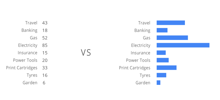 Logically, users are after numbers, because that where the core information is. Why is there a need to visualize the data?
It seems like there is a purely visual mechanism that helps us to understand data in a different way when we look at the image, as compared to just the display of numbers, - a new meaning appears.
Data Vis Masterclass
 Hi,
The talk was interesting and very instructive - very much appreciated, thank you very much for doing it!
Hi,
The talk was interesting and very instructive - very much appreciated, thank you very much for doing it!
This has rather to do with 'theoretical' approach to graphic arts rather than any particular talks that you do, but it seems crucial (or fun!) to define where is that distinction between the design being 'good' /'bad' (or 'successfull' / 'unsuccessful'). Been thinking about that, as it has been the matter of my day-to-day practice for years.
I agree with you here - and that's my personal belief, too - that 'design' of any set of data exists disregarding whether a person who puts it together thinks/knows about it or not.
Then, agreed again, 'function' that you mention is of a big importance to successful design, and can be used as a point of view. But in this case shouldn't we deem Gapminder as an example of 'good' design (a design that is capable of holding numerous parameters, successfully employing its graphic means)?
And of course we also have McCandless, who draws his boats on the world's flood infographic. Strictly speaking this will then be 'illustration', e.g, working with a visual constituent alone, which has nothing to do with design or 'function' - which is a process of its own, but going from here we can probably say that it cannot make the 'design' more effective - as it has nothing to do with 'function' (being rather a narrative or aethetic part). It could be used, of course, to facilitate communication, but won't be dealing with 'design' of data directly, anyways. This is, of course, if we use 'function' as the main standing point.
This is also an entirely reasonable remark that Gapminder looks like Windows 95 done by statisticians, - will we then be speaking about having to 're-skin' the interface rather than having to 're-design' it?
Hope this makes any sense - I am very glad that we have these talks which provide opportunity to take a closer look at what is it we actually do and how we do it. The field is highly interesting and rapidly developing - which makes practice extremely challenging and full of fun! (:
Regards, Zhenia