• Graphics
  • Figma
  • Research
  • Newsletter
  • About
  • Contact

Zhenia Vasiliev

  • Graphics
  • Figma
  • Research
  • Newsletter
  • About
  • Contact

D&G - 1000 Plateaux sketches: Geology of Morals

tags: deleuze, guattari, 1000, philosophy, linguistics, diagram, infographics
categories: reference
Tuesday 01.05.16
Posted by Zhenia Vasiliev
 

A letter to Contently about infographics and prices

 Hi,

Again, thank you for sending this over!

Strictly speaking, there are seven parameters from which a quote for infographics is constructed:

1. What is the usage?  (Unpromoted blog post of a smaller client is priced differently from the publication on the front page of a major media portal).

2. Area of Use or Territory (I'm still looking to understand how this applies to web distribution)

3. Duration of License (digital licenses are offered on a 1,3,5 years and on Perpetuity. I think it was mentioned before that most work done on Contently is done as a work-for-hire, but in cases where it's not, it's best to build quotes based on the length of time the work is seen on client's website).

4. Client’s Profile (life dictates that it works both ways: big companies have bigger budgets, and especially advertising (!). On the other hand, elite clients who are a prestige to work with, often pay little because there are too many high profile designers willing to work for them, even pro bono).

5. Client's Budget (connected to previous one).

6. Deadline (urgent jobs cost more than the normal priority ones. Also, different clients see urgency very differently, so it's worth considering something fixed, like number of days per amount of work?).

7. Expenses (travel and accommodation obviously do not apply to online freelance work, but there might be some - in your examples, there are costs for photography, where it is used).

Apart from that, are of course the very reasonable considerations that you listed - complexity of data, number of visuals to be created/number of entries, how prepared the data is (how much additional research is needed).


I agree that for most cases the quotes you list in the pdf are quite realistic, but it is hard to assess them because we don't know much about their production. Illustration on page 4 is easy to do visually and probably wouldn't require much research, but we don't know what were the deadlines and how much the photographer charged for his picture. Besides, usage rights for this image by now should be sky high, because it is so well-known! Authors who came up with such a brilliant idea should have quoted a lot, despite of visual simplicity.

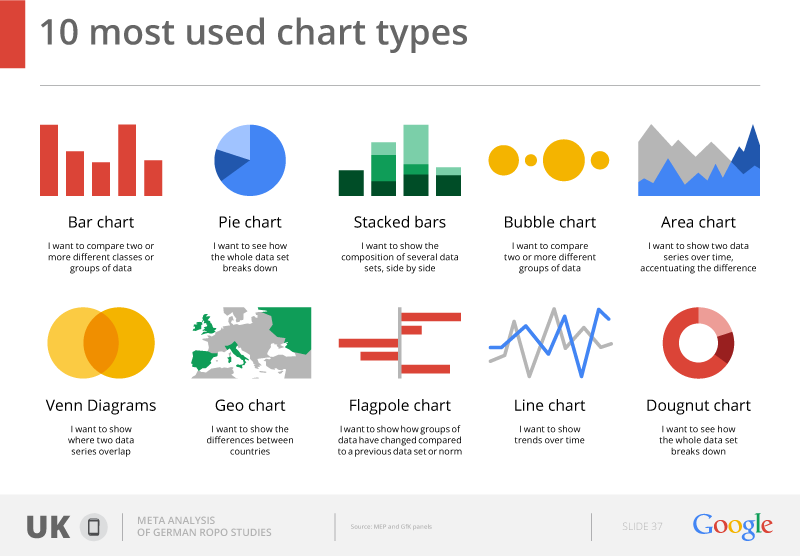
- The categorization is another potential threat, because not all timelines are the same, and the prices for them vary greatly - the same goes for maps, comparisons, and other genres - some of them take weeks to do, others are very easy.

- The other important point with regards to the pricing is that the boundary between the writer, the producer and the designer in the infographics are very vague. The writer creates the text, and does research for that, but the production of the visual story is a completely different thing. Text for the infographic has to be cut down to a few dozen words (that's editor's work, which is often done by designers), and there has to be an approved wireframe in place before any design work starts. Producers often do the wireframes, but in those cases where they only manage and research, the fees for design work has to compensate for creation of wireframes. Often designers have to do research, too.

Hope this helps - wanted to thank you again for working on this! Very much appreciated your efforts!

Best regards,
Zhenia

tags: writing, pricing, infographics, letter, contently
categories: research notes
Monday 02.16.15
Posted by Zhenia Vasiliev
 

A font for building charts: FF Chartwell

Such a great idea, to use OpenType technology to convert math formulas to actual visualization! Have yet to test it - but thank you very much to my colleague Jim Kynvin for spotting it! Font is made by FontFont: here's the source link.

tags: font, typesface, data visualization, infographics, design, typography, opentype
categories: reference, research notes
Tuesday 12.02.14
Posted by Zhenia Vasiliev
 

Hitchcock graphic in the book

Our Hitchock infographic appears in the Taschen new Infographics book!

Infographic infamy at Graphic Towers! pic.twitter.com/wPDmBbAwmw

— Aimée Stewart (@NativesAgency) November 5, 2014
tags: book, infographics, hitchcock
categories: research notes
Thursday 11.06.14
Posted by Zhenia Vasiliev
 

Ten most used chart types

(from Digital Agency to Google) 10_most_used_charts

tags: charts, design, digital agency, graphics, infographics
categories: reference, research notes
Thursday 06.26.14
Posted by Zhenia Vasiliev
 

So why do infographics work, then?

nums_vs_graphics Logically, users are after numbers, because that where the core information is. Why is there a need to visualize the data?

It seems like there is a purely visual mechanism that helps us to understand data in a different way when we look at the image, as compared to just the display of numbers, - a new meaning appears.

tags: cognitive, composition, data visualization, design, infographics, psychology
categories: reference
Friday 05.30.14
Posted by Zhenia Vasiliev
 

Our infographic on Forbes' website

Beth Hoffman kindly mentions the three pieces we produced for CCAFS:forbes_cc

tags: Adam Frost, digital agency, forbes, guardian, infographics
categories: research notes
Tuesday 04.08.14
Posted by Zhenia Vasiliev
 

Steff Geissbuhler, Blazer financial services poster, 1974

image

tags: design, infographics
categories: reference
Wednesday 08.28.13
Posted by Zhenia Vasiliev
 

Infographic 101 project log

infographic-101-screenshot-220813-10-21 Version 1. The initial idea is to do an infographic about how to do an infographic, and test out the 'flat iconography' aesthetics (along the lines of Google and Mailchimp's flat icon design). Initial data set consisted on four main parts: Data, Story, Chart and Design, so the start point was to select four main colours and to do a wireframe with one big introductory screen and four consequtive parts, each having its own colour, plus gray.

While working on the wireframe, I also thought it could be nice to go really big with all elements, and make the graphic viewable on the mobile screen (but I had to complete the first wireframe before going back to this - I want to try out a separate mobile version, with a really narrow artboard).

Follow-up ideas: make a supplementary (black-an-white, derived from Google's flat icons) icon set, and use consistent height/width rectangles for each of the sections.

Structure: Part 1 - introduction (data, story, chart, design). Parts 2-5: 1) term, class of word (noun,verb), transcription; term definition ("data is Facts and stats collected together for reference or analysis"); 2) supplementary field (e.g. 'analysing your data'): icon, 2-deck subhead, 3-4 lines of text; 3) Professionals field (e.g., Designer, Data Analyst); 4) Tools field (e.g. Microsoft Excel, Adobe Illustrator); 5) Try it! field: 1-deck heading + 2 or 3 tick-marked 2-deck slogans (e.g. "MARKING UP A SPREADSHEET", "SKETCHING CHARTSWITH KEY DATA").

Next step: mobile version on a narrow artboard, especially intro screen with big header and four icons.

tags: 101, illustrator, infographics, project log, vector
categories: research notes
Thursday 08.22.13
Posted by Zhenia Vasiliev
 

Data Vis Masterclass

Screen Shot 2013-07-24 at 19.02.24 Hi, The talk was interesting and very instructive - very much appreciated, thank you very much for doing it!

This has rather to do with 'theoretical' approach to graphic arts rather than any particular talks that you do, but it seems crucial (or fun!) to define where is that distinction between the design being 'good' /'bad' (or 'successfull' / 'unsuccessful'). Been thinking about that, as it has been the matter of my day-to-day practice for years.

I agree with you here - and that's my personal belief, too - that 'design' of any set of data exists disregarding whether a person who puts it together thinks/knows about it or not.

Then, agreed again, 'function' that you mention is of a big importance to successful design, and can be used as a point of view. But in this case shouldn't we deem Gapminder as an example of 'good' design (a design that is capable of holding numerous parameters, successfully employing its graphic means)?

And of course we also have McCandless, who draws his boats on the world's flood infographic. Strictly speaking this will then be 'illustration', e.g, working with a visual constituent alone, which has nothing to do with design or 'function' - which is a process of its own, but going from here we can probably say that it cannot make the 'design' more effective - as it has nothing to do with 'function' (being rather a narrative or aethetic part). It could be used, of course, to facilitate communication, but won't be dealing with 'design' of data directly, anyways. This is, of course, if we use 'function' as the main standing point.

This is also an entirely reasonable remark that Gapminder looks like Windows 95 done by statisticians, - will we then be speaking about having to 're-skin' the interface rather than having to 're-design' it?

Hope this makes any sense - I am very glad that we have these talks which provide opportunity to take a closer look at what is it we actually do and how we do it. The field is highly interesting and rapidly developing - which makes practice extremely challenging and full of fun! (:

Regards, Zhenia

tags: Data, data visualization, infographics, Masterclass, Vis
categories: reference
Wednesday 07.24.13
Posted by Zhenia Vasiliev
 

Zhenia Vasiliev © 2025