

A font for building charts: FF Chartwell
Such a great idea, to use OpenType technology to convert math formulas to actual visualization! Have yet to test it - but thank you very much to my colleague Jim Kynvin for spotting it! Font is made by FontFont: here's the source link.

Giorgia Lupi of Accurat: Drawing and Designing Data Vis
"The fact then that since I can't have data on paper when I am sketching what comes to mind and designing a data visualization, I feel that it is very helpful to explore visual features and visual aggregations that start exactly from what you have in mind, and that can serve to open questions on the data itself. I see this as a shortcut from your head to the final piece of data visualization."

Three distinct phases for me in my design process:
- A first phase when I am interested in the main macro categories of data we are analyzing;
- second phase where I just focus on the singular elements, the entry points that we have, to figure out which shapes, colors, features we might invent to better represent them
- Final phase where I would structure what I’d expect to finally create, not in illustrator (digital format), but on paper

Sketching the Infographic for London First

Sketches from yesterday-2
Different-coloured dry pastels.


Moonscape's The Future We Have All Been Waiting For is out today!
A new major collaboration from me and electronic musician Moonscape: his new album The Future We Have All Been Waiting For which is out today and a series of nine drawings I made for it (one per track).
Listen to the music: https://play.spotify.com/album/26j123jxGvGqpJsnAt3dDx
And look at my drawings while you do:http://www.evasilev.com/drawing/#/tfwhabwf/
Congratulations to Daniil Aleksandrov!

City of Westminster Archives


Sketch from Great Peter street

Charcoal
Brno
Street sketch from Brno this summer - just found it.

Sketch from The Hop and Berry

Photo from Urbino Summer School
Just heard from Ilaria Ruggeri, who sent this nostalgic photo of our group from WT/ISIA Urbino Summer School in July. Fun times these were! Thank you for tutors and fellow Summer Schoolers!

Equations: Marcel Duchamp, Marchant du sel
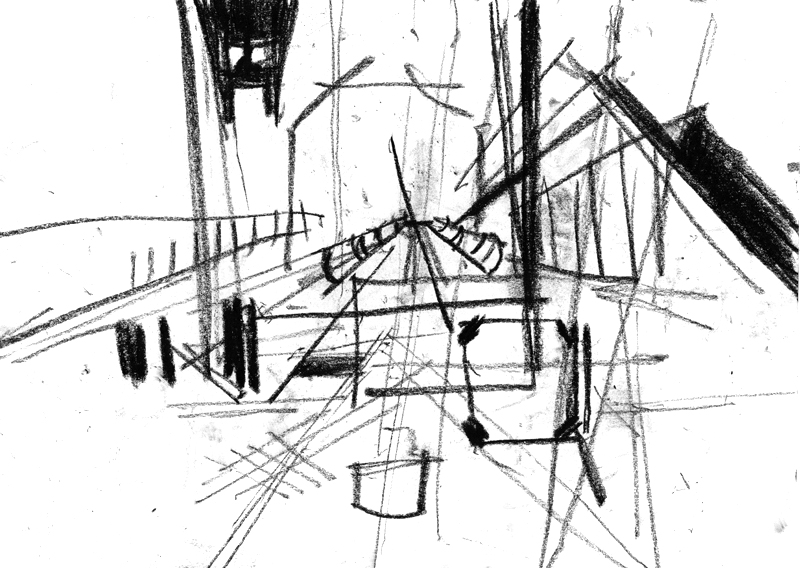
I quite like the idea of an equation, because it doesn't point only to art or to science, but has that universal kind of feel for any aspect of life. Artist is of course an equation with his art, meaning that an artist is not balanced if she does not create. But so is everybody else - any person finds its own approach, their own process that balances things out, to get to that cosmic equation that is so much spoken of in Nature and in human mind, and in relation of the two.
Equation, in turn, is a mathematical concept which lends itself quite logically to visual representation. This is a thing to think about, but here's a quick sketch made the other day of some kind of logical construction found in real life:

Basically, two dudes covering the roof of a building - one below, another on the top. The circular motion of the bucket connects the two, and so does their own co-motions. The lower man goes to the car on our right to fill the bucket, the top man goes to the left out of the picture to do the roof work. Then the process repeats.
Sketches: Lego the Movie
Tried to capture main directional lines rather than compositions of any particular screens.
Our Insults infographic goes live!
Which insults are most offensive? Adam Frost and I have looked at the data behind rude words:http://www.buzzfeed.com/adamfrost72/great-british-insults-which-words-are-the-most-of-147xc?s=mobile

Territory Studio: Icons for The Guardian
A sparkling example of how deep an icon starts to look when you place a grid behind it, although in this case, these are masterfully designed icons! Here's a link to the full presentation. #guardian #icons


Pastel smudgings

The Infographics Atlas has arrived!
With our piece about Hitchcok films in it. Congrats @adamfrostuk and a big thank you to @srendgen!


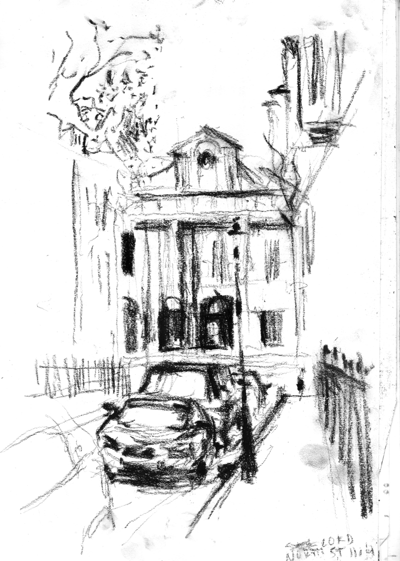
Lord North Street
Pastel
Icons from Pu-Ergh tea pack

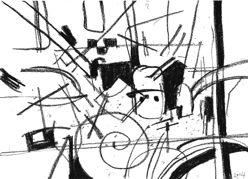
Sketches from yesterday

Pastel